Color correction is a crucial aspect of visual media, transforming raw footage or images into captivating pieces. It’s not just about fixing colors; it’s about crafting the perfect visual mood and enhancing the storytelling. From photography to filmmaking, understanding and applying color correction techniques is essential for achieving desired results.
This comprehensive guide delves into the world of color correction, exploring various techniques, tools, and practical applications. We’ll examine the fundamental principles, different color spaces, and common software used. Ultimately, this guide aims to equip you with the knowledge and tools to master color correction and elevate your visual projects.
Introduction to Color Correction
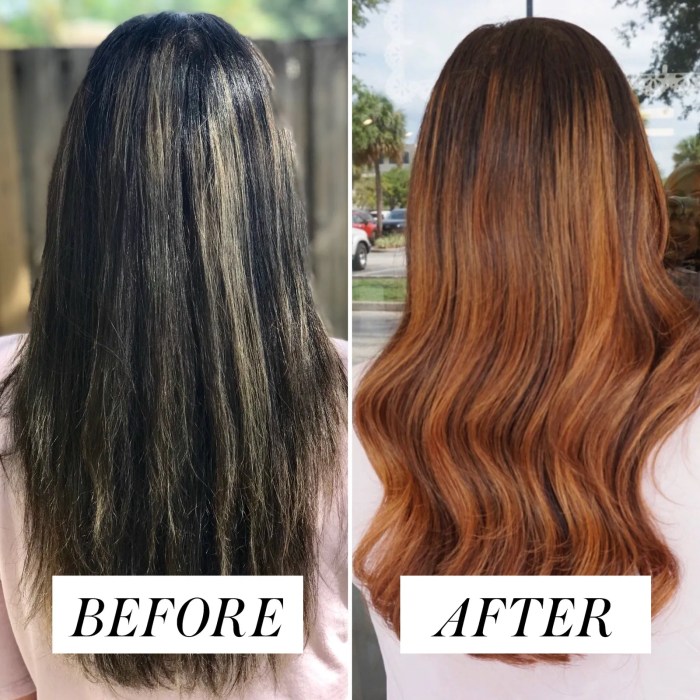
Color correction is the process of adjusting the color balance, saturation, and contrast of an image or video to achieve a desired aesthetic or enhance its visual impact. This encompasses a wide range of techniques and tools used across various media platforms, from photography to film and television. It’s a crucial step in post-production, ensuring that the final product aligns with creative intent and effectively communicates the message.Color correction is essential in various media forms to ensure visual consistency and impact.
In film, for example, accurate color grading can create mood and enhance the storytelling. In photography, color correction can adjust lighting inconsistencies and create a more harmonious image. In video production, color correction is critical for maintaining a consistent look throughout a project, ensuring that all scenes blend seamlessly.
Fundamental Principles of Color Correction
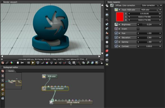
Color correction is based on understanding the color model used (e.g., RGB, CMYK) and the properties of light. Key principles include adjusting hue, saturation, and luminance (brightness). Understanding the color wheel, color temperature (measured in Kelvin), and white balance are crucial for achieving effective color correction. White balance is critical in neutralizing the color cast introduced by different light sources.
Common Color Correction Techniques
Various techniques are employed depending on the industry and desired outcome. These include adjusting levels, curves, and color grading. Level adjustments manipulate the intensity of different color channels, while curves offer a more granular control. Color grading is a more advanced technique used to create a specific mood or aesthetic, often employing tools like LUTs (look-up tables).
These adjustments are often iterative, with the goal of refining the overall look and feel of the material.
Color Correction Tools and Applications
Color correction relies on various software tools. The effectiveness and ease of use of these tools vary depending on the user’s skill level.
| Tool | Application | Advantages | Disadvantages |
|---|---|---|---|
| Adobe Photoshop | Photography, image editing | Highly versatile, powerful features for image manipulation | Steep learning curve, complex workflow for some tasks |
| DaVinci Resolve | Film, video, television | Comprehensive features, powerful color grading tools, free version available | Large file sizes, sometimes a steep learning curve for new users |
| LUTs (Look-Up Tables) | Photography, video, film | Fast results, easily applied to achieve specific looks | Limited control over the color correction process, might not be suitable for complex edits |
Color Spaces and Color Models: Color Correction
Color spaces and models are fundamental concepts in color correction. They define how colors are represented and manipulated within a digital system. Understanding these systems is crucial for achieving accurate and desired color results. Different color spaces cater to various applications and have specific characteristics that influence how colors appear and are handled.Color spaces provide a structured framework for representing colors numerically.
This allows computers and software to understand and manipulate colors precisely. They are critical in color correction because they dictate how colors are interpreted and transformed during the editing process. Different color spaces offer varying ranges of colors and are designed for specific purposes, such as photography, printing, or video.
RGB Color Model
The RGB color model is the dominant model for digital displays and image editing. It uses red, green, and blue light to create a vast spectrum of colors. Each color channel (red, green, blue) is represented by a value between 0 and 255, defining the intensity of that color component. This allows for a wide range of color representation, making it suitable for displaying images on screens.
A typical RGB image can hold millions of colors, offering a high level of detail and accuracy for photographic and visual display applications.
CMYK Color Model
The CMYK color model is primarily used for printing. It uses cyan, magenta, yellow, and black inks to create colors. The inks absorb certain wavelengths of light, and by combining them in varying amounts, different colors are produced. CMYK is designed for physical media, unlike RGB, which is for digital displays. This model is important for creating consistent and accurate colors when producing printed materials.
Color accuracy in printed materials relies on understanding the CMYK color space and its limitations compared to RGB.
CIE XYZ Color Space
The CIE XYZ color space is a standardized color space that defines colors in a device-independent way. It’s not directly perceivable, but serves as a fundamental reference for other color spaces. The CIE XYZ space is often used for color matching and color management. This standardized color space helps in establishing consistency across different devices and applications, and is a key element in color management workflows.
It acts as a neutral reference point, enabling the conversion between different color spaces.
Adobe RGB
Adobe RGB is a wider color gamut than sRGB, encompassing more colors. This is especially beneficial for photographers working with high-quality images and professionals needing a wider range of color representation. Its extended color space allows for a greater level of detail and accuracy, particularly when dealing with natural colors, and is important for photo editing and printing where more vibrant colors are desired.
sRGB
sRGB is a widely adopted color space for web displays and general use. Its relatively narrow color gamut is suitable for everyday use and web content. sRGB’s standard is widely supported by displays and software, making it the common standard for online viewing.
Color Profiles
Color profiles are crucial for accurate color reproduction. They contain information about a specific color space, including its gamut, white point, and other characteristics. Using the correct profile ensures colors are rendered correctly, preventing color shifts or inaccuracies during the color correction process. Using incorrect profiles can lead to misinterpretations of colors. Correct profiles are necessary for achieving consistent and accurate colors across different devices and software.
Techniques and Methods
Color correction techniques are crucial for enhancing visual appeal and consistency across various media. Understanding these methods allows filmmakers, photographers, and editors to achieve desired aesthetic effects and improve the overall impact of their work. From subtle adjustments to dramatic transformations, color correction is a powerful tool.Color grading, white balancing, and exposure adjustment are fundamental techniques used to refine the visual characteristics of images.
These techniques, when employed strategically, can dramatically alter the mood, tone, and overall aesthetic of a project. For instance, a warmer color palette can evoke a sense of comfort and nostalgia, while a cooler palette can create a sense of detachment or unease.
Color Grading Techniques
Color grading involves adjusting color characteristics to achieve a specific visual mood or style. It’s a sophisticated process that allows for nuanced control over hue, saturation, and luminance. By strategically manipulating these elements, color graders can evoke specific emotions or convey a particular atmosphere. For example, a film noir style often employs desaturated colors and a high contrast to create a sense of mystery and intrigue.
Color correction is crucial for any image, setting the stage for further enhancements. Often, this involves adjusting the overall tone and vibrancy, which is a great stepping stone for more extensive image editing, like Image retouching. Ultimately, color correction is a foundational aspect of professional image enhancement.
White Balance Adjustment
White balance adjustment is crucial for correcting color casts, ensuring accurate representation of colors under different lighting conditions. This process aligns the image’s color temperature to match the light source, preventing unwanted color shifts. For instance, indoor lighting often produces a warm color cast, while outdoor daylight can result in a cool color cast. Correcting the white balance ensures consistent color representation across various scenes or lighting conditions.
Exposure Adjustment Techniques
Exposure adjustment allows for control over the overall brightness and contrast of an image. Adjusting exposure can significantly impact the visual impact of a scene. For instance, a high-key image with increased brightness creates a bright and cheerful atmosphere, while a low-key image with reduced brightness evokes a dramatic or mysterious mood.
Color Matching Across Media
Color matching ensures consistency in color representation across different media, such as film, video, and digital imagery. This process is crucial for maintaining a cohesive look and feel throughout a project. For example, if a film uses specific color palettes, the digital post-production should aim for similar color representations to maintain the aesthetic continuity. A table summarizing key color correction techniques follows:
| Technique | Description | Effect |
|---|---|---|
| Color Grading | Adjusting color characteristics (hue, saturation, luminance) | Creates visual mood, evokes specific emotions |
| White Balance | Adjusting color temperature to match light source | Corrects color casts, ensures accurate color representation |
| Exposure Adjustment | Adjusting overall brightness and contrast | Improves image contrast, enhances visual mood |
Tools and Software
Color correction, a crucial aspect of post-production, relies heavily on the right software and tools. Choosing the appropriate tools depends on factors like budget, experience level, and specific project needs. Different software packages offer varying functionalities and features, each catering to diverse workflows and aesthetic preferences. Understanding the strengths and weaknesses of each tool is essential for making informed decisions.
Software for Color Correction
Various software applications are available for color correction, ranging from free and open-source options to professional-grade paid suites. The choice depends on the user’s experience and budget, as well as the scope and complexity of the project.
Popular Color Correction Software
A variety of software options cater to different needs and skill levels. Choosing the right tool depends on the project’s requirements and the user’s familiarity with the interface.
Functionality of Color Correction Tools
Color correction tools offer a wide array of functionalities. These tools typically include color grading, color balancing, and white balancing features. Advanced features may include tools for adjusting contrast, saturation, and sharpness. The availability of these tools varies between different software packages. Some applications also provide specific functionalities for correcting color casts or specific color issues.
A comprehensive toolset facilitates accurate and efficient color correction.
Benefits and Drawbacks of Different Tools
Different software packages offer various advantages and disadvantages. The strengths and weaknesses of a tool can significantly impact the user experience. The most important considerations are ease of use, versatility, and compatibility with other tools.
Comparison of Popular Color Correction Software
The table below compares popular color correction software based on features, advantages, and disadvantages. Understanding the strengths and weaknesses of each application can guide the user in selecting the most appropriate tool.
| Software | Features | Advantages | Disadvantages |
|---|---|---|---|
| Adobe Premiere Pro | Comprehensive editing suite, including advanced color grading tools, robust effects, and integration with other Adobe Creative Cloud applications. | Powerful features, extensive customization options, and seamless integration with other Adobe products. Widely used and supported. | Steep learning curve, high cost, and potential performance issues on less powerful systems. |
| Final Cut Pro | Mac-specific editing suite with intuitive interface and powerful color grading tools. | User-friendly interface, excellent performance on macOS, and well-integrated with other Apple applications. | Limited compatibility with other platforms, potentially less versatile than Premiere Pro for complex projects. |
| DaVinci Resolve | Free, professional-grade software offering a vast array of color correction tools, including advanced grading tools, and post-production capabilities. | Cost-effective, powerful, and comprehensive features for color grading. Excellent for a wide range of projects, from independent productions to major films. | Steep learning curve for advanced features, potential performance issues with large projects, and limited integration with other applications. |
Practical Applications
Color correction is a crucial post-production technique that significantly impacts the final product’s aesthetic appeal and communicative effectiveness across various media. Beyond simply adjusting color tones, it shapes viewer perception, evokes specific emotions, and ultimately enhances the storytelling within a film, photograph, or video. Proper color correction can transform a mundane scene into a visually compelling narrative.
Examples in Film, Photography, and Video
Color correction is integral to the final look of film, photography, and video. In film, it allows directors and cinematographers to achieve a consistent visual style throughout the project, refining the mood and tone of specific scenes. In photography, color correction is essential for adjusting for lighting variations, ensuring accurate color representation, and improving the overall visual impact.
Similarly, video production leverages color correction to maintain a cohesive aesthetic, enhance clarity, and convey specific emotions or themes.
Use in Specific Industries
Color correction plays a pivotal role in several industries, significantly impacting the final product’s success. In advertising, color correction is employed to create compelling visuals that grab attention and effectively communicate a product’s message. A carefully crafted color palette can evoke specific emotions and associations with a brand, enhancing its perceived value. In filmmaking, color correction allows directors to fine-tune the visual narrative, ensuring the film’s aesthetic and emotional impact resonate with the intended audience.
This is achieved through careful selection of color palettes, adjustments to contrast and saturation, and subtle shifts in hue to create a desired mood or evoke specific emotions.
Enhancing Visual Storytelling
Color correction is a powerful tool for enhancing visual storytelling. A carefully chosen color palette can set the scene, define the characters, and influence the emotional response of the viewer. Consider how color palettes can establish a particular tone. For instance, a warm, golden hue can convey a sense of nostalgia or happiness, while a cool, muted palette can suggest sadness or mystery.
Color correction is crucial in establishing a consistent visual style throughout a film or video, thereby enhancing the narrative coherence.
Improving Viewer Engagement
Color correction directly influences viewer engagement. By enhancing the visual appeal and clarity of the media, color correction can maintain audience attention and create a more immersive experience. Visually appealing content draws the viewer in, holding their interest and allowing them to connect with the story more effectively. For example, vivid colors can heighten excitement, while muted tones can evoke a sense of serenity.
This direct link between color and viewer response underlines the importance of thoughtful color correction in various media.
Affecting Mood and Emotion
Color correction profoundly impacts the mood and emotions evoked by media. Different colors evoke different emotional responses in viewers. A warm color palette can evoke feelings of happiness, comfort, and nostalgia, while a cool color palette can create a sense of calmness, serenity, or even melancholy. This emotional impact is a significant factor in creating effective media.
By carefully selecting and adjusting colors, filmmakers, photographers, and video editors can manipulate viewer perception and create a desired emotional response to their work.
Color Correction Workflow
A well-defined color correction workflow is crucial for achieving consistent and high-quality results. It involves a systematic approach to image manipulation, ensuring that the final product meets the desired aesthetic and technical standards. This structured process not only saves time but also minimizes errors and inconsistencies, leading to a more efficient and professional output.Color correction is not a one-size-fits-all process; the specific steps and techniques employed depend heavily on the nature of the media being corrected and the desired outcome.
Understanding the specific characteristics of different media types, such as film, digital photos, or video footage, is essential for tailoring the workflow accordingly.
Step-by-Step Guide to Color Correction
A standardized workflow provides a roadmap for consistent color correction across various projects. The following steps represent a common and effective approach, adaptable to diverse media and desired aesthetics.
- Assess the Original Image: Thorough examination of the original material is the foundation of any successful color correction project. This includes analyzing the overall color palette, lighting conditions, and any existing color casts or inconsistencies. Identifying these elements early allows for more targeted and effective adjustments later in the process. Recognizing potential issues like overexposed areas, underexposed shadows, or uneven color temperature provides a starting point for problem-solving.
- Adjust White Balance: Correcting the white balance is a fundamental step to ensure accurate colors. Incorrect white balance introduces a color cast that affects the entire image, making subsequent adjustments more complex. Techniques for white balance adjustment include using a grey card, a specific white balance preset, or manually adjusting the temperature and tint settings. This step is crucial for setting a proper foundation for subsequent color corrections.
- Correct Exposure: Exposure adjustments aim to balance the light and dark areas of the image, preventing both overexposure and underexposure. Tools like levels, curves, and highlights/shadows adjustments are used to refine the tonal range, creating a more natural and balanced image. Adjustments in this stage ensure that the image has a correct dynamic range, making it more aesthetically pleasing and technically sound.
- Fine-tune Color: This is where specific color adjustments are made. Tools like color wheels, color sliders, and hue/saturation controls can be used to refine the overall color palette and individual colors. This phase is iterative and involves careful observation of the image to ensure the adjustments enhance the desired aesthetic. The aim is to bring the colors to a pleasing, realistic, or even stylized look, based on the specific needs of the project.
Color Correction in Different Media
The color correction process adapts to various media formats. Film, digital photos, and video footage all have unique characteristics requiring specific approaches.
- Film: Film color correction often involves emulation of specific film stocks or achieving a vintage look. This might involve adjustments to color temperature, saturation, and contrast to match the characteristics of the film stock. Careful consideration of the original film’s color characteristics is essential.
- Digital Photos: Digital photos may require correction for color casts, exposure issues, or other technical imperfections. Modern software offers advanced tools to precisely target and adjust these elements, leading to a more polished final product.
- Video Footage: Video color correction requires a different approach than still images, considering the dynamic nature of the moving image. This may involve frame-by-frame adjustments, color grading, and color correction tools specific to video editing software. The workflow should ensure consistent color across the entire video sequence.
Color Grading Procedure
Color grading is a specialized form of color correction, aiming to achieve a specific aesthetic. It’s a crucial part of video editing, enhancing visual storytelling.
- Establish a Look: This involves defining the desired visual style, considering the overall mood and tone of the video. This could range from a realistic look to a highly stylized or cinematic look.
- Apply Color Adjustments: Specific color adjustments are made to achieve the established look. Tools like color wheels, color ramps, and curves are employed for fine-tuning the color palette.
- Assess and Refine: Continuous evaluation of the color grading is essential. This iterative process ensures the desired aesthetic is achieved while maintaining the integrity of the original footage.
Typical Color Correction Workflow Table
| Step | Description |
|---|---|
| 1 | Assess the original image, identifying color casts, exposure issues, and other potential problems. |
| 2 | Adjust white balance to ensure accurate colors. |
| 3 | Correct exposure, balancing light and dark areas of the image. |
| 4 | Fine-tune color using tools to achieve the desired aesthetic. |
Color Grading and Aesthetics
Color grading is a crucial post-production step in filmmaking and video editing that transcends simple color correction. It’s the art of manipulating colors to evoke specific emotions, enhance visual appeal, and ultimately contribute to the overall aesthetic and storytelling of a piece. This process goes beyond merely adjusting brightness and contrast; it’s about shaping the viewer’s experience through carefully chosen color palettes and techniques.Color grading is a powerful tool for crafting distinct moods and atmospheres.
It can transform a scene from a vibrant celebration to a somber reflection, or a gritty urban landscape to a serene pastoral setting, all through subtle shifts in hue, saturation, and tone. This transformative power is essential for filmmakers seeking to communicate specific emotions and create a cohesive narrative experience.
Impact on Visual Aesthetics
Color grading significantly influences the visual aesthetics of a project. It can heighten the visual impact of scenes by drawing attention to key elements or creating a sense of depth and dimension. By adjusting color temperature, saturation, and contrast, filmmakers can create a visual language that complements the narrative and elevates the overall aesthetic quality.
Mood Creation Through Color Grading
Color grading is instrumental in establishing specific moods and atmospheres. A warm, golden hue can evoke feelings of nostalgia or comfort, while a cool, desaturated palette can create a sense of isolation or melancholy. By strategically manipulating color tones, filmmakers can subtly guide the audience’s emotional response to the story. For example, a film set in a winter landscape might utilize a bluish-gray color palette to convey a sense of cold and isolation.
Conversely, a film set during a vibrant summer festival could employ a warm, saturated palette to convey joy and excitement.
Color Grading and Storytelling
Color grading is a vital component of storytelling. It can enhance the emotional impact of a scene, highlighting specific characters or themes. By employing specific color palettes, filmmakers can subtly communicate the emotional state of a character, the atmosphere of a location, or the underlying themes of a scene. For instance, a character experiencing inner turmoil might be depicted with muted or desaturated colors, while a character feeling triumphant could be highlighted with vibrant, saturated hues.
This subtle manipulation of color allows filmmakers to communicate complex emotions and narratives through visual cues.
Examples of Color Grading Styles in Different Genres
Different genres often utilize specific color grading styles to enhance the narrative. Action films might employ a high-contrast, vibrant palette to emphasize the dynamism and intensity of the action sequences. Romantic comedies often utilize a warmer, more saturated color palette to highlight the joy and romance. Horror films frequently use a desaturated or bluish palette to create a sense of dread and unease.
Documentary films, on the other hand, might opt for a realistic, neutral color palette to maintain a sense of objectivity and authenticity.
Color correction is crucial for any photo editing workflow. Software like Capture One provides powerful tools to fine-tune your images, ensuring accurate and consistent color representation. The results are often quite impressive, making it a popular choice for professional photographers seeking precise color correction.
Achieving Specific Aesthetic Effects Through Color Correction
Color correction and grading techniques allow filmmakers to achieve a variety of aesthetic effects. Specific techniques, such as color grading filters and color grading software, can manipulate the hues, saturations, and tones of images. Adjusting white balance and color temperature can drastically alter the overall mood and atmosphere of a scene. By utilizing these tools, filmmakers can enhance the visual storytelling and create a cohesive and impactful visual experience.
Common Mistakes and Troubleshooting
Color correction, while powerful, can be tricky. Understanding common pitfalls and how to troubleshoot them is crucial for achieving professional results. This section details frequent errors and effective solutions for various color correction software.
Identifying Common Mistakes
Color correction often involves subtle adjustments, making it easy to introduce errors that are difficult to spot initially. Misinterpreting the intended look, applying excessive adjustments, and neglecting the overall context of the scene are frequent pitfalls. Unintentional color shifts, inaccurate white balance, and incorrect color grading can also significantly affect the final result. For instance, applying a warm tone to a scene already exhibiting warm hues can lead to an overly saturated and unnatural result.
Troubleshooting Issues in Color Correction
Effective troubleshooting involves a methodical approach. Begin by analyzing the issue, identifying the specific problem areas, and then systematically testing various solutions. Reviewing the initial settings and comparing them with the desired outcome can provide insights into the nature of the problem. Crucially, remember to work incrementally, making small adjustments and evaluating the impact at each step.
This iterative process allows for a more controlled and predictable outcome.
Examples of Common Color Correction Problems
One common problem is inaccurate white balance. This can manifest as a scene appearing overly blue or orange, impacting the overall mood and tone. Another issue is the misapplication of color grading. Overly strong or mismatched color adjustments can result in an unnatural and jarring look. For example, a scene with a lot of skin tones might require careful adjustment to avoid over-saturation or a muddy appearance.
Furthermore, problems with contrast and saturation can lead to flat or lifeless images.
Tips for Avoiding Common Pitfalls
Maintaining a consistent workflow and adhering to established guidelines can significantly reduce errors. Utilizing a color correction checklist can help ensure that crucial aspects are not overlooked. Using appropriate color spaces, like Adobe RGB or DCI-P3, can help avoid color shifts or mismatches during the process. Furthermore, working in a well-lit and calibrated environment can greatly improve accuracy.
Troubleshooting Methods for Specific Software
Different software programs have unique features and tools for troubleshooting color correction. For example, some programs offer “undo” and “redo” capabilities, allowing users to revert or repeat adjustments. Many software packages also incorporate a “preview” mode, enabling users to evaluate the effect of corrections in real-time. Some software allows the use of presets and LUTs, which can streamline the process and avoid repetitive adjustments.
For example, in Adobe Premiere Pro, using the waveform monitor or vectorscope can help identify color imbalances or oversaturation. Understanding the specific tools and features within a particular software program is essential for effective troubleshooting.
Color Correction Software Specific Troubleshooting (Example: Adobe Premiere Pro)
Adobe Premiere Pro provides various tools for troubleshooting color correction issues. The waveform monitor displays the luminance levels of the video, helping identify areas with overexposure or underexposure. The vectorscope visually represents the hue and saturation of colors, allowing for adjustments to balance and avoid color shifts.
Future Trends in Color Correction
The field of color correction is constantly evolving, driven by advancements in technology and creative demands. This dynamic environment necessitates a forward-thinking approach, understanding emerging trends and their potential impact on the future of color grading. Predicting the exact future is challenging, but examining current trends provides a valuable insight into possible developments.
Emerging Technologies in Color Correction
Recent advancements in hardware and software are significantly impacting color correction workflows. High-resolution displays and cameras are producing images with unparalleled detail, demanding corresponding advancements in color management and correction tools. Real-time color grading and adjustments are becoming more accessible and crucial for efficient workflows. This translates into faster iterations and greater control during the creative process.
The use of advanced sensors and colorimetry techniques is allowing for more precise color reproduction and measurement.
Impact of Artificial Intelligence on Color Correction
Artificial intelligence (AI) is rapidly transforming various creative fields, and color correction is no exception. AI-powered tools can automate repetitive tasks, such as color balancing and white point adjustment. This automation frees up artists to focus on creative aspects of color grading, allowing for more nuanced and expressive results. AI algorithms can analyze images and suggest color adjustments based on predefined styles or user preferences, streamlining the workflow and opening up new creative possibilities.
For instance, AI can identify and correct color casts in images with high accuracy.
Advancements in Color Correction Techniques
Color correction techniques are continuously refined, expanding beyond traditional methods. The rise of machine learning algorithms enables the development of more sophisticated color correction tools, offering personalized adjustments and predictive capabilities. Techniques that consider the context of the image, such as scene analysis and understanding, are emerging, leading to more nuanced and contextually appropriate color corrections. The use of non-linear color transforms is becoming more prevalent, enabling more precise and targeted adjustments.
For example, algorithms can be trained to recognize and correct color inconsistencies across different parts of a scene, such as a cloudy sky or a complex landscape.
Potential Evolution of Color Correction
The future of color correction is likely to be characterized by a combination of automation and artistic expression. AI will likely take on more of the routine tasks, enabling artists to focus on more complex and creative aspects of color grading. Improved color matching and consistency across different platforms and devices will become increasingly important, especially with the rise of immersive technologies like virtual reality and augmented reality.
This may involve advanced color management systems that can adjust color based on the viewing environment.
Examples of Current Trends and Their Potential Impact
One current trend is the integration of AI into color correction software. This allows for faster and more precise adjustments, potentially leading to a reduction in post-production time and cost. Another trend is the development of tools for non-linear color grading, enabling more complex and nuanced adjustments to specific elements within an image. This may lead to a greater diversity of artistic styles and a more personalized approach to color correction.
Furthermore, advancements in color-matching technology are enabling better consistency across various platforms, from film to digital. This is particularly relevant in a world increasingly relying on digital content and devices.
Closing Summary
In conclusion, color correction is a multifaceted process that significantly impacts the overall visual appeal and emotional impact of any media. From understanding color spaces to mastering specific techniques and tools, this guide has provided a solid foundation for your color correction journey. Remember to practice, experiment, and develop your own unique style in color correction to create stunning visuals.
Quick FAQs
What is the difference between color grading and color correction?
Color correction aims to fix technical issues like white balance and exposure, while color grading is more about artistic choices, creating mood and aesthetic appeal.
What is a LUT and how is it used in color correction?
LUTs (Look-Up Tables) are pre-defined color settings that instantly apply a specific color grading style. They’re helpful for quickly achieving a desired look.
What are some common mistakes in color correction?
Over-correction, ignoring the original intent, and lack of consistency across the entire project are frequent mistakes.
How can I improve my color correction workflow?
Establishing a clear workflow, using consistent tools, and regularly practicing are key to improvement.