Color correction in Photoshop is a crucial skill for any image editor. Understanding color models like RGB, CMYK, and Lab, along with the tools and techniques within Photoshop, empowers you to transform images. This guide delves into the fundamentals and advanced aspects of color correction, covering everything from basic adjustments to sophisticated color grading.
From adjusting brightness and contrast to correcting white balance and using adjustment layers, this comprehensive exploration equips you with the knowledge and skills to master color correction in Photoshop. Explore the nuances of color correction for diverse image types, including portraits, landscapes, and product photography. The guide also addresses troubleshooting common issues and optimizing your workflow.
Introduction to Color Correction in Photoshop
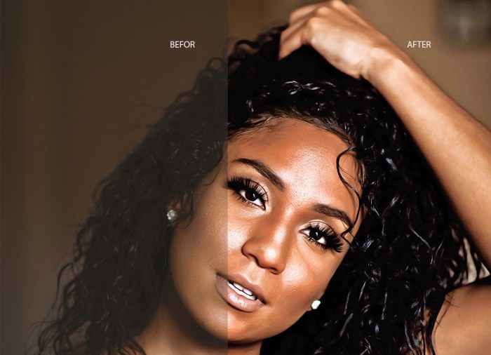
Color correction in Photoshop is a crucial aspect of image editing, enabling significant enhancements to the visual appeal and impact of an image. It involves adjusting the colors, tones, and overall color balance of an image to achieve a desired aesthetic. This process is vital for creating professional-quality images, ensuring consistency in color representation across different media, and enhancing the overall message conveyed by the image.Color correction is fundamental to image editing because it allows for the manipulation and refinement of colors to match specific requirements or artistic visions.
The process involves understanding color models and spaces to effectively adjust hue, saturation, and brightness, resulting in a visually appealing and accurate representation of the subject matter. A well-executed color correction process can elevate an image from merely acceptable to truly exceptional.
Color Models and Spaces
Color correction relies heavily on understanding different color models and spaces. RGB (Red, Green, Blue) is an additive color model commonly used for displays and digital images. CMYK (Cyan, Magenta, Yellow, Key/Black) is a subtractive color model primarily used for print media. Lab (Lightness, a, b) is a device-independent color space, offering a more perceptually uniform representation of color.
Understanding these models allows for targeted adjustments during the color correction process, ensuring accuracy and consistency across various applications and outputs.
Workflow and Steps in Color Correction
A typical color correction process in Photoshop often involves several key steps. Initial assessments of the image’s current color characteristics are performed. This is followed by selective adjustments to achieve the desired aesthetic. The workflow frequently includes adjustments to brightness and contrast, color balance, white balance, and saturation. The specific steps will vary based on the image and the desired outcome, but these core principles generally apply.
Color Correction Tools in Photoshop
The following table Artikels several common color correction tools in Photoshop, along with their primary functions:
| Tool | Basic Function | Description | Example Use Case |
|---|---|---|---|
| Levels | Adjusts the tonal range of an image | Adjusts the highlights, midtones, and shadows to create a more balanced tonal range. | Improving contrast in an image that is too dark or too bright. |
| Curves | Adjusts tonal range and color curves | Provides more granular control over tonal ranges and color curves, allowing for precise adjustments of highlights, midtones, and shadows. | Creating specific tonal curves to accentuate specific elements within the image. |
| Color Balance | Adjusts the color balance of an image | Balances the amount of red, green, and blue in an image, enabling the correction of overall color casts. | Correcting a yellowish or bluish tint in an image. |
| Hue/Saturation | Adjusts hue, saturation, and lightness | Allows for independent adjustments of the color’s hue, saturation, and lightness. | Making the colors in an image more vibrant or muted, or correcting a specific color cast. |
Basic Color Correction Techniques
Color correction in Photoshop is a crucial aspect of image editing, enabling adjustments to enhance visual appeal and achieve desired aesthetics. These techniques are fundamental for improving the overall quality and impact of photographs. From subtle adjustments to dramatic transformations, mastering these methods unlocks a powerful toolkit for refining images.Adjusting brightness and contrast is a fundamental technique in color correction.
Brightness controls the overall lightness or darkness of an image, while contrast defines the difference in tones between the lightest and darkest areas. These adjustments are often performed in tandem to create a balanced and visually appealing image. These adjustments are frequently applied in conjunction with other corrections to ensure a cohesive result.
Brightness and Contrast Adjustments
Brightness and contrast adjustments are often the first steps in a color correction workflow. These adjustments, when applied strategically, can significantly improve the overall look of an image. By increasing or decreasing brightness, one can control the overall lightness or darkness of the image. Similarly, adjustments to contrast can enhance the differences in tone between the highlights and shadows, adding depth and visual interest.
Levels and Curves Tools
The Levels and Curves tools provide more precise control over tonal adjustments. The Levels tool allows you to manipulate the histogram, adjusting the input and output levels of the image’s tonal range. This allows for precise control of highlights, midtones, and shadows. The Curves tool offers a graphical representation of the tonal adjustments, enabling more nuanced control over the tonal relationships within the image.
Curves adjustments are often preferred for more subtle or targeted changes, and for advanced corrections.
Color Balance Tool
The Color Balance tool enables selective color adjustments. It allows you to modify the amounts of red, green, and blue in specific areas of the image, thereby enabling targeted color corrections. This tool is useful for balancing or correcting color casts in a specific area of an image, particularly helpful in images with uneven lighting or unwanted color shifts.
Color correction in Photoshop is a crucial step in any photo retouching workflow. Mastering this technique significantly elevates your image’s overall quality, and for a comprehensive understanding, check out The Ultimate Guide to Retouching Photos in Photoshop. This guide provides a deep dive into various retouching techniques, including the intricacies of color correction, ensuring your photos are polished and professional.
Hue/Saturation Tool
The Hue/Saturation tool provides precise control over the color characteristics of the image. It allows for adjustments to the hue, saturation, and lightness of individual colors. This tool is valuable for correcting specific colors, removing unwanted color casts, or creating artistic effects. Specific adjustments can enhance colors in portraits or landscapes to better suit the intended mood or aesthetic.
White Balance Correction
White balance correction is essential for ensuring accurate color representation in images. It adjusts the color temperature of the image to compensate for variations in light sources. Different light sources, such as incandescent, fluorescent, or daylight, can produce different color casts. Adjusting white balance can significantly improve the color accuracy of an image, especially when dealing with images taken under mixed lighting conditions.
For example, a photograph taken indoors under incandescent lighting may appear orange or yellow, requiring white balance adjustments to achieve a neutral or natural look.
Color Correction Examples
| Image Type | Color Correction Adjustments |
|---|---|
| Portrait | Adjusting skin tone for a more natural look, enhancing eye color, correcting unwanted redness or blemishes, and improving overall skin texture. |
| Landscape | Balancing colors in different parts of the scene, adjusting color temperature to match the mood of the scene, enhancing the vibrancy of natural colors, and increasing clarity of skies or water features. |
| Product Photography | Ensuring accurate color representation of the product, adjusting color temperature to match studio lighting, enhancing product details by increasing contrast, and removing unwanted color casts or reflections. |
Advanced Color Correction Techniques
Diving deeper into color correction in Photoshop unlocks powerful tools for enhancing images beyond basic adjustments. Advanced techniques allow for more nuanced control over color, enabling the creation of specific moods and aesthetics, and the accurate representation of colors in various scenarios. This section explores these techniques, from color grading and matching to the strategic use of masking and adjustment layers.Color correction is not just about making images look good; it’s about making them
- accurate* and
- intentional*. Advanced techniques provide the tools to refine and manipulate color to achieve specific artistic or practical goals, whether it’s creating a cinematic look or ensuring consistent color across multiple images.
Color Grading
Color grading is a sophisticated technique that involves manipulating color tones, saturation, and contrast to achieve a desired aesthetic. It’s commonly used in film and video production but is increasingly popular for enhancing still images. Color grading can dramatically alter the mood and atmosphere of an image, from a vibrant, sunny feel to a moody, dramatic one. This process often involves using multiple adjustment layers, curves, and selective color adjustments to fine-tune color temperature, tint, and saturation.
Color Matching
Color matching is the process of ensuring that colors in different images or from different sources appear consistent. This is crucial for tasks like retouching photos or working with multiple images from a photoshoot, or when integrating photos into a design project. Photoshop’s color management tools are essential for accurate color matching, allowing users to adjust colors to a specific profile or standard.
Correct color matching helps maintain visual harmony and avoids jarring color inconsistencies. This is particularly important for commercial projects or projects requiring high precision in color reproduction.
Color Profiles and Color Management
Color profiles define how colors are displayed and printed. Proper color management in Photoshop ensures consistent color representation across different devices and software. By understanding and utilizing color profiles, photographers and designers can avoid color discrepancies between images viewed on different monitors or printed on various devices. This ensures that the final output matches the intended color vision.
Using the correct profile for the intended output device (e.g., sRGB for web, Adobe RGB for print) is critical.
Masking Techniques for Targeted Color Corrections
Masking allows for precise control over color adjustments. By creating masks, users can isolate specific areas of an image and apply color corrections only to those areas. This precision is vital for delicate retouching, such as fixing color casts on a person’s skin without affecting the background. Masking techniques are especially useful for targeted adjustments to specific elements of an image without altering the rest of the scene.
This precision is essential for achieving natural-looking results.
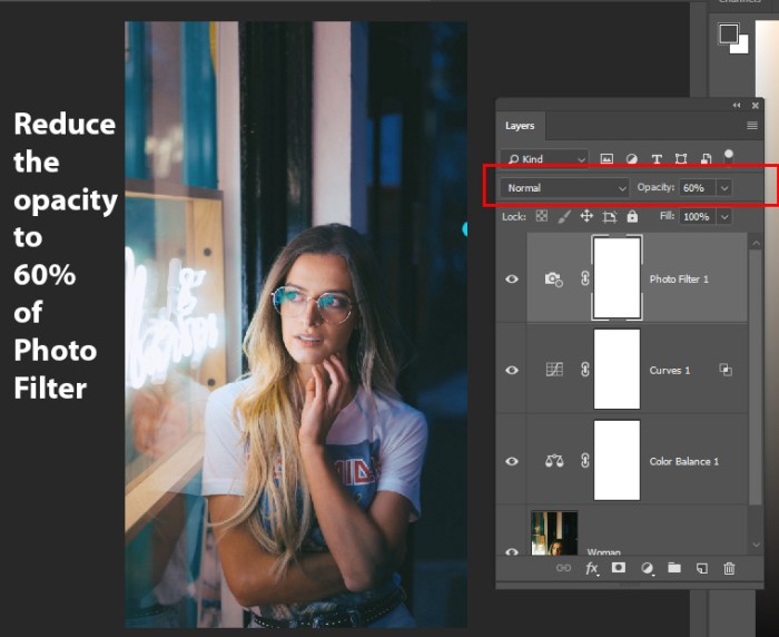
Adjustment Layers for Non-Destructive Adjustments
Adjustment layers are a fundamental aspect of non-destructive editing in Photoshop. These layers allow users to apply adjustments without directly modifying the original image data. This is invaluable for experimenting with different color corrections without permanently altering the original image. This feature provides flexibility and control during the editing process. If you need to revisit or modify the adjustment, you can do so without impacting other parts of the image.
Creating Specific Color Moods or Aesthetics
Creating specific color moods or aesthetics in images is a creative process that relies on understanding how different colors evoke emotions and feelings. By strategically using color grading techniques, color profiles, and targeted adjustments, designers and photographers can create a wide range of visual styles. Careful manipulation of color temperature, saturation, and contrast allows for a wide range of aesthetic choices.
| Feature | Adjustment Layers | Direct Adjustments | Comparison |
|---|---|---|---|
| Non-Destructive Editing | Yes, changes are applied to a separate layer. | No, changes are applied directly to the image layer. | Adjustment layers preserve the original image data, allowing for easy adjustments and reversions. |
| Reversibility | Changes are easily reversible by turning off or modifying the adjustment layer. | Changes are harder to reverse without potentially impacting other image adjustments. | Adjustment layers provide a clear history of changes. |
| Impact on Other Adjustments | Changes are isolated to the layer. | Changes can affect other adjustments in the image. | Adjustment layers maintain the integrity of other adjustments. |
| Flexibility | Multiple adjustments can be applied to one layer, making adjustments more complex. | Applying multiple adjustments involves more complex manipulation of the image layer. | Adjustment layers allow for a more controlled approach to advanced editing. |
Color Correction for Specific Image Types
Color correction isn’t a one-size-fits-all process. Different image types demand specific approaches to achieve optimal results. Understanding these nuances allows photographers to tailor their color correction strategies for maximum impact and consistency across various genres. This section delves into targeted color correction techniques for portraiture, landscapes, and product photography.
Portrait Photography: Skin Tone Adjustments
Effective skin tone adjustments are crucial in portrait photography. These adjustments aim to create a natural and appealing representation of the subject’s complexion while maintaining a realistic aesthetic. Overly saturated or unnatural skin tones can detract from the overall impact of the portrait. Strategies involve careful manipulation of hue, saturation, and luminance to achieve a balanced and flattering result.
Using the “Selective Color” tool in Photoshop allows precise adjustments to specific color components within the skin tones, ensuring accurate and nuanced modifications. A consistent approach to skin tone enhancement, particularly when working with a series of portraits, ensures a cohesive visual style.
Landscape Photography: Natural Color Representation
Landscape photography relies heavily on accurate color representation to convey the essence of the scene. The goal is to capture the natural colors of the environment, including skies, vegetation, and water bodies, without introducing artificial enhancements. Color correction in landscape photography frequently involves balancing exposure and color temperature across the entire image. This is often achieved using tools like the “Curves” adjustment layer to subtly adjust tonal ranges and color gradients.
Specific attention is given to the sky, which often requires separate adjustments to maintain a believable representation of atmospheric conditions. A key consideration is the time of day and weather conditions, as these significantly impact the overall color palette of the landscape.
Product Photography: Accurate Color Reproduction and Consistency
Accurate color reproduction is paramount in product photography. The goal is to represent the product’s colors as faithfully as possible to ensure consistency with the intended marketing materials and online displays. Color casts or inconsistencies can lead to customer dissatisfaction and potentially affect sales. Color correction in product photography often involves calibrating the camera and the monitor used for editing to maintain consistent color profiles.
Using a color checker or a calibrated color standard can aid in the accurate representation of colors in the product images. The consistency of color across multiple images of the same product is critical for maintaining brand identity and consumer perception.
Key Considerations for Color Correction in Different Image Types
| Image Type | Primary Goal | Key Adjustments | Specific Considerations |
|---|---|---|---|
| Portrait Photography | Natural and appealing skin tones | Hue, saturation, luminance adjustments; selective color corrections | Consistency across subjects; avoiding unnatural enhancements |
| Landscape Photography | Accurate representation of natural colors | Balancing exposure and color temperature; adjustments to tonal ranges and gradients | Considering time of day and weather conditions |
| Product Photography | Accurate color reproduction and consistency | Calibration of camera and monitor; using color checkers | Ensuring consistency across multiple images of the same product |
Working with Color Profiles and ICC
Color accuracy is paramount in professional photography and graphic design. Color profiles are crucial for ensuring consistent and predictable color reproduction across various devices and software applications. Understanding these profiles and their management is essential for achieving accurate and reliable results.ICC (International Color Consortium) color profiles are the industry standard for color management. They define the color characteristics of devices, such as monitors, printers, and scanners, enabling software to accurately translate colors from one device to another.
This ensures that colors appear consistently across different platforms, avoiding discrepancies between intended color and displayed color.
Significance of Color Profiles in Accurate Color Reproduction
Color profiles are essential for achieving accurate color reproduction. They act as a bridge between the intended color in a digital image and the way it’s displayed or printed. Without profiles, colors can shift dramatically due to variations in device calibrations. A profile-based workflow helps maintain the desired color consistency.
ICC Color Profiles and Their Role in Color Management
ICC profiles define the color characteristics of a specific device. They contain information about the device’s color gamut, its response to different wavelengths of light, and its overall color rendering capabilities. This data allows software to translate colors from one device’s color space to another’s, ensuring consistent representation. Color management systems use these profiles to map colors between different devices, thereby preserving color accuracy throughout the workflow.
Selecting Appropriate Color Profiles for Different Workflows
Choosing the correct color profile depends on the specific workflow. For example, a photographer editing images for a web display might select a profile optimized for web browsers, whereas a commercial printer would use a profile designed for their specific printing equipment. Understanding the intended output device is crucial for selecting the correct profile. A critical step is to identify the intended display and printing devices to select the most suitable profile.
Embedding Color Profiles in Images for Optimal Color Preservation
Embedding color profiles directly into images is vital for maintaining color accuracy throughout the image’s lifespan. This ensures that the color information is preserved even when the image is moved between different systems or devices. When the profile is embedded, the software knows how to interpret the color data correctly.
Types of Color Profiles and Their Usage
Different color profiles cater to various applications and devices. Choosing the right profile is critical for maintaining consistent color throughout the workflow. The table below illustrates different profile types and their typical usage:
| Profile Type | Device | Usage | Example |
|---|---|---|---|
| Monitor Profile | Computer Monitor | Accurate display of colors on the monitor. | Adobe RGB 1998, sRGB |
| Printer Profile | Printer (Inkjet, Laser) | Accurate color reproduction when printing. | Printer manufacturer profiles, custom profiles |
| Camera Profile | Digital Camera | Represents the color response of the camera. | Camera manufacturer profiles |
| Input Profile | Scanner, Camera | Describes the color characteristics of the device used to capture the image. | Scanner profiles, RAW image profiles |
Troubleshooting Color Correction Issues
Color correction, while powerful, can sometimes lead to unexpected results. Understanding potential problems and their causes is crucial for achieving accurate and consistent color representation across images and devices. This section delves into common pitfalls and effective troubleshooting strategies.Troubleshooting color correction involves identifying the source of inaccuracies and employing appropriate techniques to rectify them. This proactive approach ensures that your color-corrected images maintain their intended visual fidelity and avoid inconsistencies.
Common Color Correction Problems and Causes
Inaccurate color representation can stem from various factors, including improper calibration of your monitor, incorrect color profiles, or issues with the original image itself. Understanding the root causes empowers you to effectively target the problem and achieve desired results.
Troubleshooting Inaccurate Color Representation
Identifying inaccurate color representation often involves comparing your work to a reliable reference. Ensure your monitor is properly calibrated and that you’re using the correct color profiles for your image type. A consistent workflow, using standardized settings, minimizes the risk of unexpected color shifts.
Color Discrepancies Between Devices
Color discrepancies between different devices, such as monitors, printers, and mobile displays, are a common challenge. These discrepancies arise due to variations in device calibration and color profiles. To mitigate these differences, use consistent color profiles throughout your workflow. Consider using a calibrated colorimeter to match the color output on different devices more closely.
Dealing with Color Cast Issues
Color casts, such as overly warm or cool tones, can significantly impact the overall visual appeal of an image. Understanding the causes of color casts, such as incorrect white balance settings or issues with the original image, is essential for effective correction. Employing selective adjustments to specific color channels or using the color balance tool can help correct these issues.
Table of Common Color Correction Problems and Solutions
| Problem | Cause | Troubleshooting Steps | Solutions |
|---|---|---|---|
| Inaccurate Colors | Incorrect color profiles, miscalibrated monitor | Verify color profile settings. Compare output to a known good source. | Recalibrate monitor, use appropriate color profiles. |
| Color Cast (Warm/Cool) | Incorrect white balance, lighting issues in the original image | Examine the image’s white balance. Assess the overall lighting conditions. | Adjust white balance, use color balance tools, selective adjustments. |
| Color Discrepancies Between Devices | Different device calibrations, inconsistent color profiles | Ensure consistent color profiles throughout the workflow. Calibrate devices where possible. | Use consistent color profiles, consider using a colorimeter for device calibration. |
| Unwanted Color Shifts | Overly aggressive adjustments, incorrect blending modes | Review individual adjustment layers, check the blend modes. | Reduce adjustment intensity, experiment with different blend modes. |
Color Correction Workflow Optimization
Streamlining your color correction workflow is crucial for efficiency and consistency in your post-production process. A well-organized approach minimizes wasted time and maximizes the quality of your final output. This section delves into practical strategies to optimize your workflow, from leveraging keyboard shortcuts to creating automated actions.
Strategies for Streamlining the Workflow
Efficient color correction involves planning your approach before diving into adjustments. Establish a clear sequence for your corrections, prioritizing tasks such as white balance, contrast, and color grading. Break down complex corrections into smaller, manageable steps. This approach allows for better control and prevents overwhelming yourself with the entire process at once. Pre-visualization of the desired outcome can be a useful tool to guide the adjustments.
Use of Keyboard Shortcuts and Tools for Efficiency
Mastering keyboard shortcuts is paramount for rapid and precise adjustments. Familiarize yourself with the shortcuts for common color correction tools and parameters within Photoshop. Efficient use of these shortcuts reduces reliance on the mouse, leading to a significant improvement in workflow speed. This allows for more focused attention on the nuances of the image.
Creation and Use of Actions for Repetitive Tasks
Actions are a powerful tool for automating repetitive color correction tasks. By recording a series of adjustments as an action, you can apply them to multiple images with a single click. This significantly reduces the time spent on identical corrections for various images. This method is particularly useful for maintaining a consistent style across a batch of photos.
Organizing Your Color Correction Adjustments
A well-organized system for storing your color correction adjustments is essential. Create folders for different types of images, such as portraits, landscapes, or product shots. Within each folder, categorize adjustments by type (e.g., white balance, color grading, sharpening). This organization ensures you can quickly locate and apply the necessary adjustments for any image.
Common Keyboard Shortcuts for Color Correction Tools
This table provides a summary of common keyboard shortcuts for color correction tools in Photoshop. Knowing these shortcuts significantly speeds up your workflow.
| Tool | Function | Keyboard Shortcut | Description |
|---|---|---|---|
| Brightness/Contrast | Adjusts brightness and contrast | Ctrl + Shift + L (Windows) / Cmd + Shift + L (Mac) | Quickly adjusts brightness and contrast levels. |
| Levels | Adjusts tonal values | Ctrl + L (Windows) / Cmd + L (Mac) | Controls the tonal range of the image. |
| Curves | Adjusts tonal values (more control) | Ctrl + M (Windows) / Cmd + M (Mac) | Offers more granular control over tonal adjustments compared to Levels. |
| Hue/Saturation | Adjusts hue, saturation, and lightness | Ctrl + U (Windows) / Cmd + U (Mac) | Adjusts the color characteristics of the image. |
Using Actions and Presets
Automating color correction tasks in Photoshop significantly boosts efficiency and consistency. Actions and presets allow you to record a series of edits and then replay them on other images, saving valuable time and effort. This approach is particularly useful for batch processing and maintaining a consistent visual style across a portfolio.Actions in Photoshop essentially record your editing steps as a sequence of commands.
You can then execute this sequence on multiple images, applying the same adjustments to each. This is an invaluable tool for achieving consistent results and streamlining your workflow. Presets, on the other hand, offer pre-configured settings that allow you to quickly apply a specific look or style to your images. This simplifies the process of color grading and allows you to explore different visual aesthetics with minimal effort.
Creating and Editing Actions
Creating actions involves recording your desired color correction steps. Photoshop records each step, from adjustments to filters, allowing you to reproduce them with a single click. Editing actions is crucial for refining and improving their effectiveness. This involves modifying the steps within the action to fine-tune the results. You can also add or remove steps, adjust settings, and alter the order of operations to customize the action for specific needs.
Examples of Color Correction Actions
Here are a few illustrative examples of actions tailored for various color correction tasks.
- Warm-tone Conversion Action: This action adjusts the overall color temperature of an image, introducing warmer tones to create a vintage or sepia effect. It often involves adjustments to the white balance, color curves, and potentially color filters.
- High Contrast Action: This action enhances the contrast of an image by adjusting levels, curves, or shadows and highlights, making the image pop. This action is particularly useful for bringing out details in dark or light areas.
- Color Grading Action (e.g., Film Noir): This action mimics the look of a specific film style, such as Film Noir. This often involves specific color adjustments, contrast enhancements, and selective color adjustments to achieve the desired effect.
Benefits of Presets
Presets are pre-configured sets of settings that can be quickly applied to images. They save time by providing a shortcut for implementing specific looks. Using presets is useful for achieving a desired aesthetic, or applying a particular style to a series of images. They can be tailored to individual projects or even shared with other users for collaborative work.
Common Color Correction Actions
| Action Name | Description | Typical Adjustments | Use Case |
|---|---|---|---|
| Warm Tone Conversion | Adjusts image to warmer tones | White Balance, Color Curves, Color Filters | Vintage, Sepia Effect |
| High Contrast | Increases image contrast | Levels, Curves, Shadows/Highlights | Highlighting Details |
| Color Grading (e.g., Pop Art) | Mimics a specific style | Selective Color Adjustments, Color Balance | Achieving a specific aesthetic |
| Desaturation Action | Reduces the overall saturation of colors | Hue/Saturation Adjustment | Creating a desaturated or monochrome effect |
Understanding Color Spaces
Color spaces are fundamental to color correction in Photoshop. They define how colors are represented and manipulated within the software. Understanding these spaces is crucial for accurate color reproduction and avoiding unexpected results during the correction process. Different color spaces cater to various applications and have specific characteristics that impact the final image.
Color Space Overview
Color spaces are mathematical models that describe the way colors are represented numerically. They define a specific range of colors and how those colors relate to each other. Common color spaces used in Photoshop include RGB, CMYK, and Lab. Each space has its strengths and weaknesses, influencing how colors are handled and ultimately impacting the image’s output.
RGB (Red, Green, Blue)
RGB is an additive color model. It represents colors by combining varying intensities of red, green, and blue light. This model is widely used for displays, digital imagery, and web design. RGB is an excellent choice for images intended for screens, as it directly corresponds to the way monitors produce colors.
CMYK (Cyan, Magenta, Yellow, Key/Black)
CMYK is a subtractive color model. It represents colors by subtracting specific amounts of light from white. This model is primarily used for print media, such as brochures, magazines, and posters. In CMYK, colors are mixed by physically absorbing portions of the spectrum, resulting in different colors depending on the substrate. Using RGB for print will lead to inaccurate color reproduction.
Lab (Lightness, a, b)
Lab is a device-independent color space. It’s based on a perceptual model of color, aiming to represent color in a way that is more closely aligned with how humans perceive color differences. This is particularly useful for color matching and correction, as it doesn’t depend on the specific characteristics of a display or printer. This space is often used as an intermediary space for color conversions and adjustments.
Color Space Conversions
Converting between color spaces is a common task in image editing. Photoshop offers tools to efficiently perform these conversions. The chosen conversion method directly impacts the image’s visual characteristics and the preservation of color fidelity. Conversion methods should be chosen based on the image type and intended use.
Conversion Methods
Photoshop provides built-in tools for converting between different color spaces. These conversions use mathematical formulas to transform color values from one space to another. Carefully selecting the conversion method is vital to preserve the desired visual characteristics of the image.
Color Space Implications on Image Output
The color space chosen for an image directly affects its output. For instance, an RGB image intended for print will likely look different on the final printed product compared to a CMYK image. Similarly, a Lab image intended for web use may not match the intended colors when displayed on a monitor. Choosing the appropriate color space for the intended output method is crucial for accurate color reproduction.
Color Space Characteristics and Applications
| Color Space | Characteristics | Applications | Example |
|---|---|---|---|
| RGB | Additive model; Wide gamut; Device-dependent | Digital displays, web graphics, photo editing | Images on a computer monitor |
| CMYK | Subtractive model; Limited gamut; Device-dependent | Print media (e.g., brochures, posters, magazines) | Printed advertisements |
| Lab | Device-independent; Perceptual; Wide gamut | Color matching, color correction, image editing | Accurate color reproduction across different devices |
Color Correction for HDR Images
HDR images, capturing a wider range of light and shadow than standard images, often require specialized color correction techniques. Direct application of standard methods can lead to unrealistic results, compromising the intended dynamic range and visual impact. Careful consideration of the unique characteristics of HDR data is crucial for achieving accurate and aesthetically pleasing corrections.
HDR Image Characteristics and Challenges
HDR images possess a significantly wider tonal range compared to standard images. This wide dynamic range, while showcasing exquisite detail in highlights and shadows, can present challenges during color correction. The tonal gradation in HDR images can be particularly complex, demanding sophisticated tools and techniques to maintain the nuances of the scene. Additionally, the inherent nature of HDR images, particularly the high contrast between different areas of the image, necessitates careful handling to avoid clipping and loss of detail.
Color Correction Methods for HDR Images
HDR images benefit from dedicated software tools and workflows. Techniques specific to HDR images often involve adjusting the tone mapping curve, which controls the transition between highlights and shadows. Using specialized color grading tools and techniques is crucial for achieving realistic and harmonious results. These tools allow for the fine-tuning of color balance and saturation across the extended tonal range, while maintaining the image’s inherent dynamic range.
Strategies for Maintaining Detail and Accuracy
Maintaining detail in HDR color correction requires a meticulous approach. Avoid over-aggressive adjustments that can obscure the subtle details present in both highlights and shadows. Employing techniques like luminance masking allows for targeted adjustments without affecting areas outside the intended range. Using a calibrated color profile ensures accuracy in color representation. Carefully evaluating the histogram and tone mapping curve is crucial for optimizing the overall visual impact of the corrected image.
Color correction in Photoshop is crucial for a polished final image. Learning to master masking techniques, like those detailed in Mastering Masking Techniques in Photoshop , significantly enhances your control over the color correction process. Precisely isolating areas for adjustments is key to avoiding unwanted color shifts in your final image edits.
Comparison of Color Correction Techniques
| Technique | Standard Images | HDR Images | Key Differences |
|---|---|---|---|
| Color Balance | Adjusting overall color temperature and tint. | Adjusting color balance across the entire tonal range, considering highlights and shadows separately. | HDR requires nuanced adjustments across the wider dynamic range. |
| Contrast Adjustment | Increasing or decreasing overall contrast. | Adjusting contrast selectively, focusing on specific tonal ranges to preserve detail. | HDR requires a more localized approach to avoid clipping and detail loss. |
| Saturation Adjustment | Increasing or decreasing color intensity. | Adjusting saturation selectively, considering how saturation interacts with the overall tonal range. | HDR requires a careful approach to saturation to avoid oversaturating highlights or desaturating shadows. |
| Tone Mapping | Not directly applicable. | Essential for translating the wide dynamic range of HDR images to a standard display. | Tone mapping is a fundamental step for HDR images, allowing the full dynamic range to be viewed. |
Color Correction and Image Quality: Color Correction In Photoshop
Color correction is crucial for enhancing visual appeal, but its impact extends beyond aesthetics. Proper color correction can significantly improve image quality, making it more informative and engaging. Conversely, careless or inappropriate techniques can degrade image quality, obscuring details and reducing overall impact. This section explores the delicate balance between enhancing colors and preserving the inherent quality of the image.Color correction is not just about adjusting hues and saturations; it’s about maintaining the image’s fundamental attributes, including sharpness, detail, and overall visual fidelity.
This often involves a careful consideration of the tools and techniques employed to achieve the desired results.
Impact on Overall Image Quality
Color correction, when performed effectively, can dramatically enhance image quality by increasing clarity, visual appeal, and overall impact. However, poorly executed color correction can negatively impact the image, leading to loss of detail, unnatural color shifts, and reduced sharpness. The key is to employ techniques that preserve the integrity of the original image data while enhancing its visual characteristics.
Maintaining Image Sharpness and Detail
Preserving sharpness and detail during color correction is paramount. Techniques that avoid excessive sharpening or blurring during color adjustments are vital. Carefully adjusting contrast, brightness, and saturation without overdoing it helps to maintain the image’s inherent sharpness and detail. Avoid aggressive sharpening filters, which can introduce artifacts and degrade the image. Instead, use tools designed to maintain or subtly enhance existing details, avoiding harsh or unnatural transitions.
Effects of Color Correction Techniques on Resolution
Different color correction techniques can have varying impacts on image resolution. For example, excessive color adjustments can introduce artifacts or loss of subtle details, potentially reducing effective resolution. However, careful and selective adjustments, such as using masking techniques to isolate specific areas for correction, can maintain resolution. A crucial aspect is understanding the image’s inherent resolution and applying corrections that complement, not detract from, it.
Balancing Color Correction with Image Preservation
Achieving the desired color correction while maintaining image quality requires a delicate balance. Using non-destructive editing techniques is crucial to prevent permanent alterations. This approach allows for reversibility and experimentation with different corrections without permanently impacting the original image. It is often more efficient and less error-prone to work with copies of the image and make adjustments on those copies.
The choice of color correction tools and techniques should align with the specific image and desired outcome, prioritizing image integrity.
Examples of Color Correction Effects on Image Quality, Color correction in Photoshop
| Color Correction Technique | Description | Impact on Image Quality (Positive) | Impact on Image Quality (Negative) |
|---|---|---|---|
| Adjusting white balance | Correcting color casts in images | Improved color accuracy, natural-looking colors | Overcorrection can lead to unnatural colors |
| Adjusting contrast | Increasing or decreasing the difference between light and dark areas | Increased visual impact, better detail in highlights and shadows | Excessive contrast can obscure details, create harsh transitions |
| Adjusting saturation | Increasing or decreasing the intensity of colors | Enhanced vibrancy, bolder colors | Over-saturation can make colors appear unnatural |
| Using curves adjustments | Adjusting tonal values across the image | Improved tonal range, fine-tuned highlights and shadows | Incorrect use can cause color shifts or loss of detail |
Closing Notes
In conclusion, mastering color correction in Photoshop is a journey that transcends basic techniques. By understanding the intricacies of color spaces, profiles, and advanced techniques, you can elevate your image editing skills. This guide provided a structured approach, covering a broad range of techniques from basic to advanced, and addressed specific image types. We hope this comprehensive overview empowers you to confidently tackle any color correction task in Photoshop.
Detailed FAQs
What’s the difference between adjustment layers and direct adjustments?
Adjustment layers are non-destructive, meaning you can easily change or remove them without affecting the original image. Direct adjustments are made directly to the image, potentially altering the image permanently. Adjustment layers allow for more flexibility and control in the editing process.
How do I correct a color cast in an image?
Color casts are often caused by inconsistent lighting. Use the White Balance tool to identify and correct the cast. Alternatively, use the Color Balance tool for more selective adjustments. Consider the specific color of the cast to target adjustments.
What are some common mistakes in color correction?
Over-correcting, losing detail, and inconsistent results are common issues. Aim for subtle adjustments, and pay attention to the overall image balance. Review your work critically, and adjust as needed.
How can I maintain image quality during color correction?
Avoid excessive adjustments, especially with high contrast and complex images. Use adjustment layers for non-destructive editing, and ensure the final image maintains clarity and sharpness.


